
This page is a resource for painting workshops I offer online and in person. The page was first developed for a workshop offered to new painters (and those looking for a tune-up), but is meant as a useful refresher for painters at all experience levels.
For 11 February 2023 Workshop: Here are some artists and optional prompts for our workshop.
A friend, who’s an accomplished poet and brilliant teacher, is fond of reminding me that writers write, dancers dance, and painters paint. Some people have affinities for an art form, but the idea of ‘talent’ is an elusive idea — and quite likely a lie (I believe it’s an ABSOLUTE lie). The act of becoming an artist is intimately tied to doing the thing you’re called to do. It’s an alchemy between something you love (affinity) and committing the time to doing it (labor). So if you want to be a painter, fall in love with the act of painting and paint as much as you can. Remind yourself: painter’s paint! Immersing themselves in painting (making painting, looking at painting, talking about painting) is the way painter’s advance their craft.
My philosophy of teaching is to provide individualized support in service to people becoming self-directed learners. With that in mind, it’s useful to note that this page is not a curriculum that anyone can work through step-by-step. Every artist is at a different place and will need different resources at different times. This page is meant to put some useful things close at hand for the moment a need arises. As I find new resources, I’ll continue to add to the page. I’ve organized the page to have four sections: 1) Materials, 2) Drawing, 3) Composition, and 4) Color Theory.

Henry Taylor, “Cicely and Miles Visit the Obamas,” from 2017, shows Taylor’s spatial, tonal genius.
MATERIALS
To begin, I have 3 thoughts:
- I can’t emphasize enough that people should work with materials they love and that make sense in the context they’re working.
- The art world is full of silly biases and hierarchies. Oil paint is not better than any other kind of paint. Acrylic paint is not a ‘substitute’ for oil paint. Every kind of paint has unique value and inherent limitation.
- Aspire to work with the best materials you can afford.
Substrates
Substrates are the surfaces on which we paint. You can paint on almost anything. The question is how long it will last. If you want to make archival paintings — that is a painting that will last into future generations, you should consider the durability and chemical composition of the surface on which you paint. If you want to make work that self-destructs (which is totally legit) the paint on anything. That painted jack-o-lantern had value and brought delight to the world, but alas we said good-bye before the first snow!
Some common substates:
Paper: Paper is made from various materials and has various levels of acidity. Acid is what turns paper yellow over time and leads to it crumbling. Acid free papers — generally made from cotton rather than from wood — is an excellent surface for painting in almost any media. Papers with a higher acidity can be well primed with acrylic gesso to make them more archival. Similarly, cardboard (chipboard is better than corrugated cardboard) can be gessoed as a painting surface.
Arches makes a very good oil paper, which is a great, low-cost option for new painters and for making studies.
If you want to work experimentally on paper and later mount successful paintings on panels, use a PVA glue to seal the panel (to prevent the wood’s acid from yellowing the paper) and to affix the paper to the sealed panel.
Canvas: Canvas is a light-weight, durable painting surface. It can be painted on stretched or unstreched. It’s easily portable and on a large-scale results in a painting that’s easier to hang on a wall and a panel of the same size. Cotton duck canvas is the most economical canvas surface. Belgian linen is the traditional form of canvas. Canvas has a ‘tooth’ to it — basically the texture resulting from the warp and weft of the weaving process. Many coats of gesso and sanding can eliminate the tooth. Stretched canvas also has a ‘bounce’ that some artists love and others (like me) loathe.
Panel: There are many kinds of panels, but traditionally it’s referred to wood that’s cradled to avoid warping. In the modern era, masonite (which doesn’t generally warp) has been used an alternative to cradled panels. Today, high quality and inexpensive cradled panels made of maple and birch are available through most art supply stores. Panels are a rigid surface in which to work and hold up to more strenuous painting techniques.
Canvas covered cardboard panels are also mass produced. They have the tooth of canvas, but no bounce. They are not as durable as wood panels and have a tendency to warp. They are very difficult to frame. I don’t recommend them.
Metal: Artist have long painted on metal. Traditionally they would use copper sheets (etching plates). The contemporary artist, Lois Dodd, uses 5 x 7 inch aluminum roofer’s flashing (available inexpensively at the hardware store) for her small-scale work.
Priming
Traditional gesso is a mixture of gypsum and rabbit skin glue. It would have been applied to wood panels. Traditional preparation of canvas involved layers of rabbit skin glue to six the canvas and the application of thing, smooth layers of lead white paint. Today we use acrylic gesso — which is essentially a heavy body acrylic paint.
Panels and canvas require priming to prevent absorption of the paint into the substrate (which dulls colors) and the release of acid from the substrate into the paint. It also prevents corrosion of the substrate by oil paint over time. Priming also creates a smooth, durable surface on which to work.
Paint
Paint is pigment held by a vehicle (oil, acrylic medium, egg, etc.) which generally also acts as a binder. Traditionally pigments were ground ore or manipulated elements; today they are very likely to be synthetic. Because different manufacturers have different formulas for their pigments, there is often color inconsistency between paint brands.
There are may kinds of paint being used by contemporary artists. This list isn’t exhaustive, but offers a basic definition of each kind of paint.
Oil Paint: Traditionally the vehicle is a medium made from linseed oil, turpentine and damar crystals. I use a paint made with walnut oil that does not use turpentine and doesn’t give off toxic fumes. There are mediums for creating transparent glazes and additives for creating impasto. Here’s a concise overview of the genesis of oil painting in the Renaissance.
Acrylic: Pigments are suspended in a rapid-drying acrylic medium. There are additives that can extend the drying time and that make the paint more transparent.
Watercolor/Gouache: Pigment is held by gum arabic, which is soluble in water. Gouache is opaque, while watercolor is transparent. There are new acrylic gouache paints that are a high quality form of manufactured tempera paint.
Tempera: Traditionally, pigment is mixed with egg yoke. Manufactured tempera in the US usually is a cheap grade acrylic paint.
Encaustic: Pigment is suspended in a mixture of molten wax — usually a mix of beeswax and paraffin.
Casein: Pigment is suspended in milk proteins. This was a traditional way of making paint for buildings — allowing bucks of milk to spoil in the sun. Color was limited to the chemical reactions with metals — iron made red, copper green, and white was a cream color without pigment. As an artist material, casein is a flat, matte paint.
Distemper: Pigment in glue, traditionally rabbit skin glue.
Pastels: Sometimes thought of as a drawing medium, pastels are a ‘dry’ form of paint (that can combine the strengths of both painting and drawing). There are both dry pastels (composed of pigment, water and a smaller amount of chalk or artificial binder) and oil pastels (composed of pigment mixed with a non-drying oil and wax binder). Both media apply pigment directly to a surface (most often, but not limited to, paper). Both can be combined with oil paint.
Every paint has its own technique. Oil and acrylic paint are additive — that is you can build up layers and adjust light, middle and dark values throughout the process. Watercolor requires you plan a painting from light to dark, because you can’t lighten an area after color has been applied. Tempera, casein and distemper can be layered, but dry quickly and have less plasticity than oil and acrylic.
Most people in workshops use either oil paint of acrylic. They have different techniques, which we’ll discuss in the workshop. If you’re using acrylic because you don’t want to use solvents (or have fumes in your house), I recommend M. Graham walnut oil-based paints, which is the brand I use.
Brushes
Brushes are super personal. We have preference for the kind of brushes that feel comfortable to us and that allow us to make the work to which we aspire. My recommendation is to have a range of brushes at your disposal, but to avoid fancy sets. Every day I generally use brushes as small as 1/4 inch and as large as 3 inches. On rare occasions, usually when I’m making portraits, I also use tiny brushes for detail.
My own preference is for brights and filbert brushes, only using tiny rounds for detail. My go-to is always a filbert. Filberts are combination of both round and flat. The have the rectangular shape of a flat brush, but also come to a point like a round brush. Because of their unique shape, filberts can create a wide variety of marks.
This is a good resource for choosing brushes.
The best overall resource for art materials and techniques is Ralph Mayer’s The Artist’s Handbook of Materials and Techniques. It’s never failed me.

Elizabeth Peyton’s portrait of Angela Merkel. Commissioned by Vogue. Peyton used thirty years of photos from Merkel’s public life to create this composite portrait. As with much of Peyton’s work, it shows the synthesis of painting and drawing in the finished product.
DRAWING
I recently had a conversation with another painting teacher, who reminded me that the classical rule was that a student must learn to draw before they can begin painting. This rule was pragmatic, and instituted in an age when paint was a precious material — not something to be waste on students. The rule has stuck because it’s useful to have a working knowledge of design and composition before you begin painting — and it’s very useful to have a connection between the eye and the hand as you begin to make paintings. While I can justify this rule, I’m also faced with my own reality. I learned to draw by using paint. I don’t like traditional drawing media, they make no sense to me as a picture maker. It makes more sense to me to use paint as a drawing medium — and for my paintings to be drawings in paint.
Regardless of the medium you prefer, drawing is always a good thing to do. Drawing is about learning to see, and learning to connect what you se to your hand’s action. I don’t personally like to draw from the model because I find the art school convention of the nude model to be objectifying and dehumanizing. But I understand the benefit of working with a model, and understand that there are various ways to do it ethically. In our Zoom-era, there are a lot of good online figure model sessions — through drawing groups around the world (Instagram is a great resource for leaning about them). YouTube also has many, many videos of life drawing poses.
In my opinion, the best book on learning to draw is Kimon Nicolaides’ landmark The Natural Way to Draw. Every drawing book written since has been influences by his thinking. It’s an excellent overview of the history of Western drawing and a wonderful guide for self-directed learning. I’m working with it again after twenty years, and it’s very fresh.
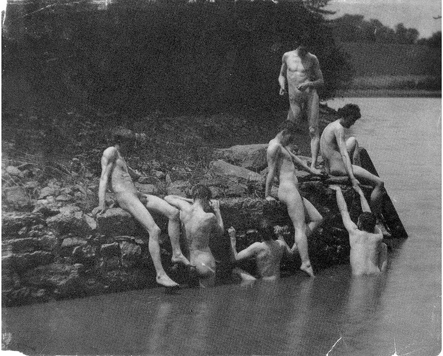

Thomas Eakins, photo reference and The Swimming Hole.
COMPOSITION
In a sense, composition and drawing are connected — both being about the act of designing on a page. Painting, however, has conventions of composition — both traditional and contemporary.
The trick of the TV painter, Bob Ross, is that he employed traditional landscape compositions — codified in the Renaissance. In their simplest form they resemble a proscenium stage, having strong vertical features on the left and right of composition, a pathway through the middle ground, and a distant destination. It’s a tried and true composition that will never fail to make a satisfying picture (because we’re trained to understand and appreciate it). There are many variations on this composition, and it changes when you add figures, work in interior spaces, or employ it on the micro level with still life.
Contemporary painters often try to break from these conventions by making, in the words of Lucian Freud, awkward compositions. Photography, cinema and television, with their framing of scenes, have opened many more ideas of how a picture can be composed.
The act of making studies is about experimenting with composition. So too is the decision to use a camera as a tool in the painting process. The camera and photography has gotten a bum rap as a tool in making paintings. David Hockney shows us how Vermeer and other Renaissance painters used the camera obscura to create designs for paintings. And ‘master draftsmen’ like Thomas Eakins used photography to create some of his most famous paintings.
The camera can help us make compositions, but it’s critical that we understand the way that monocular lenses are different from binocular vision. Lenses distort space in ways that always look like a photograph. We want to make paintings that look like the world as we perceive it — as whacky as that might be!

Henri Matisse, Interior with a Goldfish Bowl 1914. Matisse juxtaposes complementary colors and layers color.
COLOR THEORY
My pal, Roy G. Biv, taught me the basics of color.
ROY G BIV stands for Red, Orange, Yellow, Green, Blue, Indigo, Violet — the color wheel.
Browns and chromatic grays are mixed by combining complementary colors (those opposite on the color wheel) and the saturation and desaturation of color is adjusted by adding colors adjacent or opposite on the wheel. Dark and light paint (white and black, with other variations like yellow or umbers) adjust the value of a color. Those are the basics
Color theory and color mixing are a course in themselves — and a huge industry of workshops. In my opinion, people get stuck on color theory — thinking it’s the ‘secret knowledge’ of making a great painting. There are great paintings to do very little color mixing (think both Matisse or Diebenkorn or Van Gogh). The best way to learn about color is to learn the basics and experiment. If you’re super excited about making paintings about color mixing and color theory, you can always go deeper.
If you’re looking for an accessible book on mixing colors, I like Carol McIntyre’s I Just Want to Paint: Mixing the Colors You Want!

3 thoughts on “Back to Basics: a painter’s resource”